Evolving a legacy to unlock growth
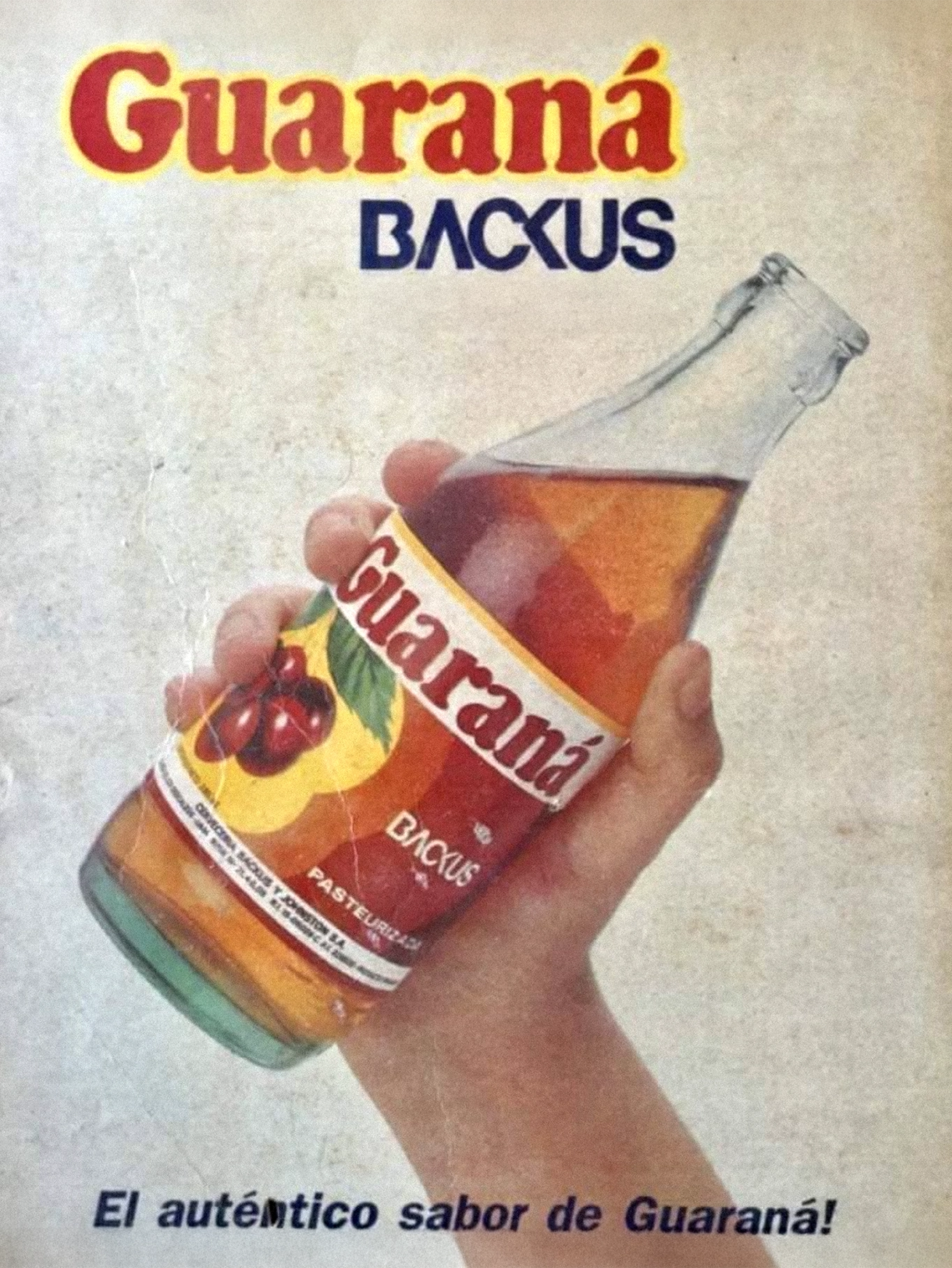
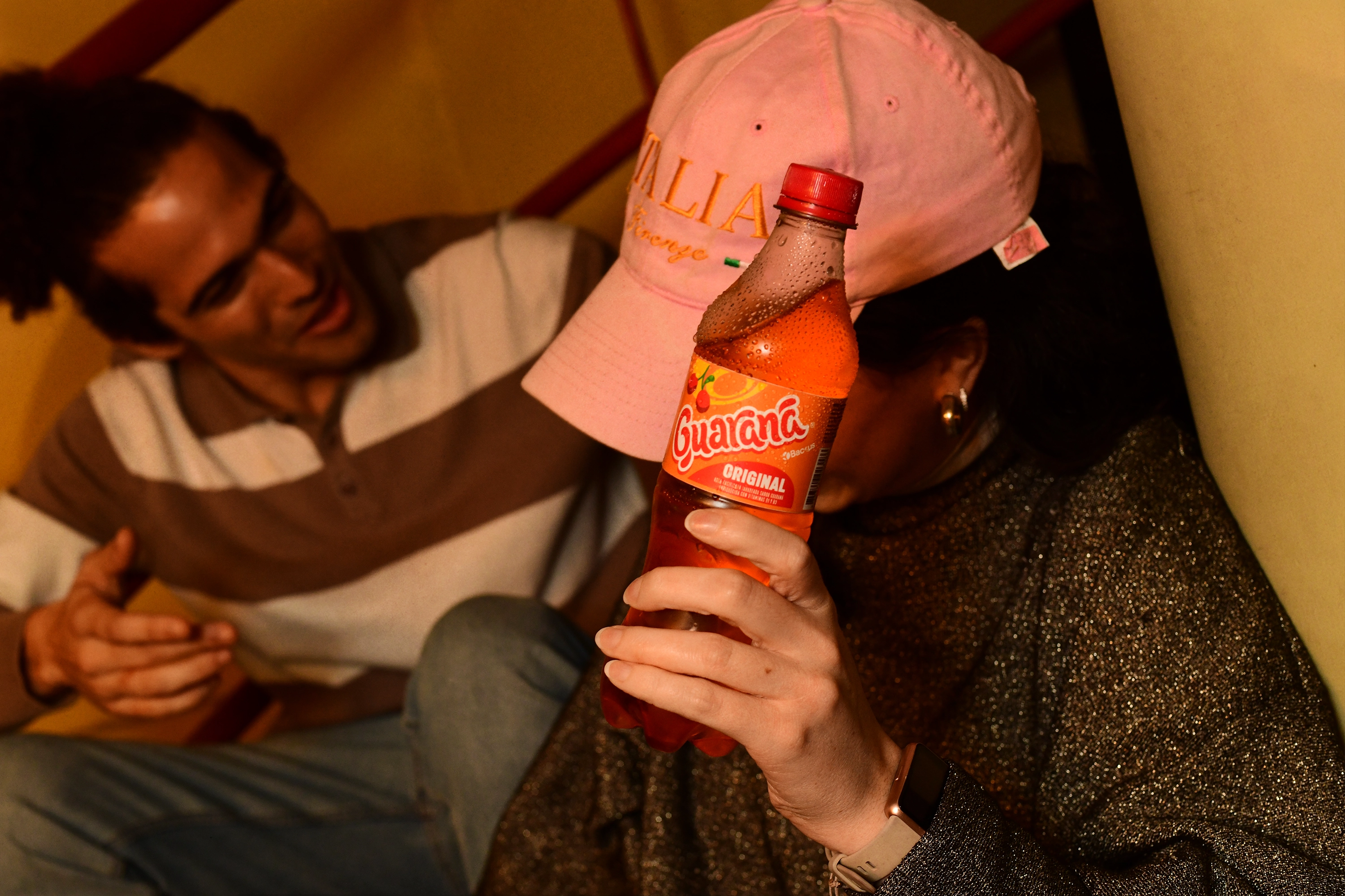
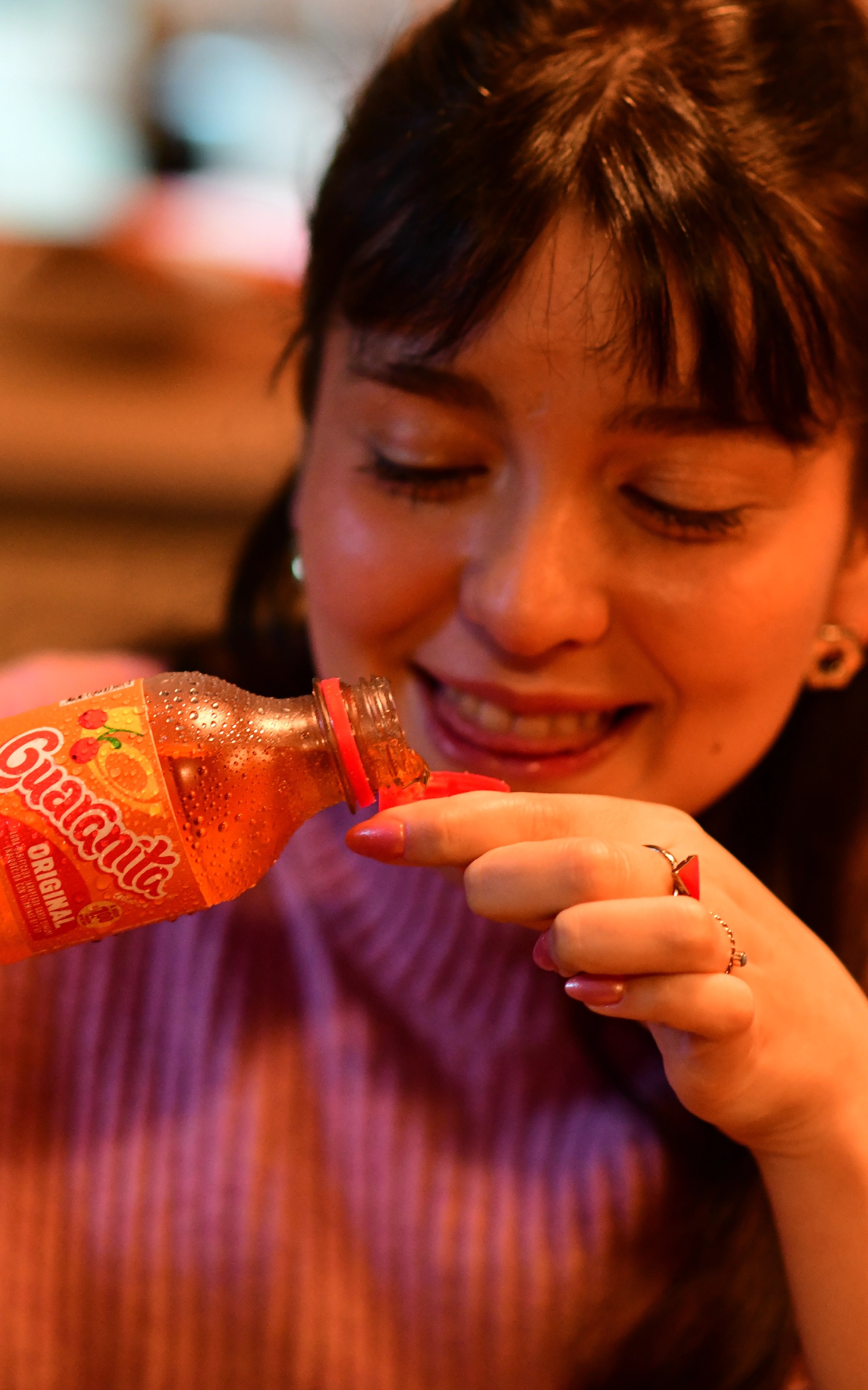
Guaraná Backus is one of the most iconic soft drink brands in Peru, with decades of history and a strong emotional connection built around freshness, joy, and youth culture. Its legacy is deeply rooted in the market. Brand equity was not something to disrupt, but something to protect while preparing the brand to evolve for the future.
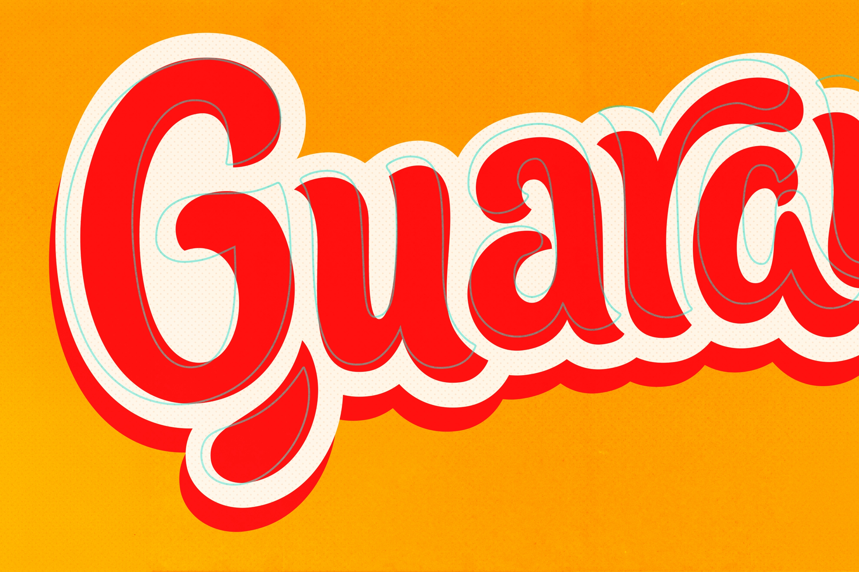
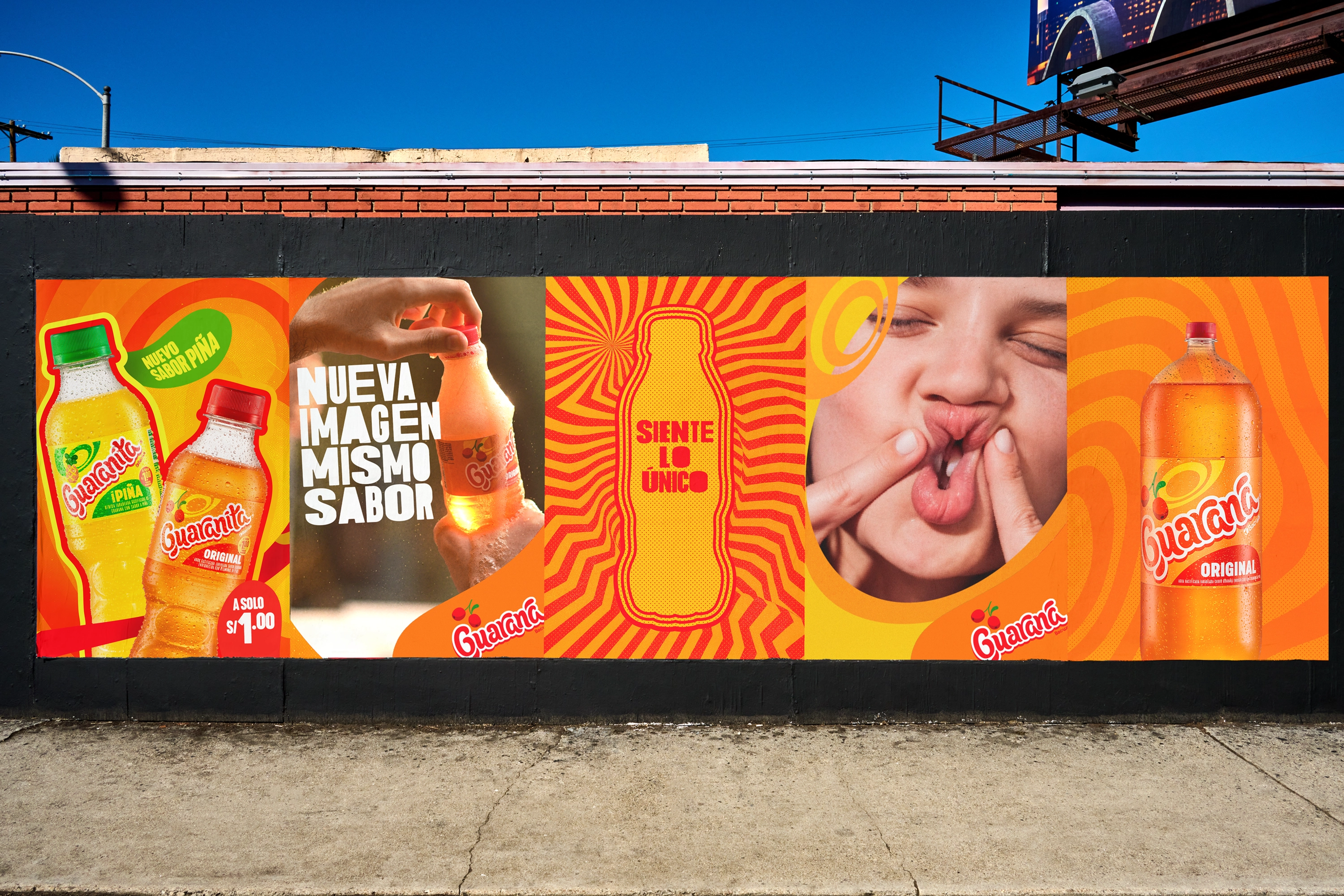
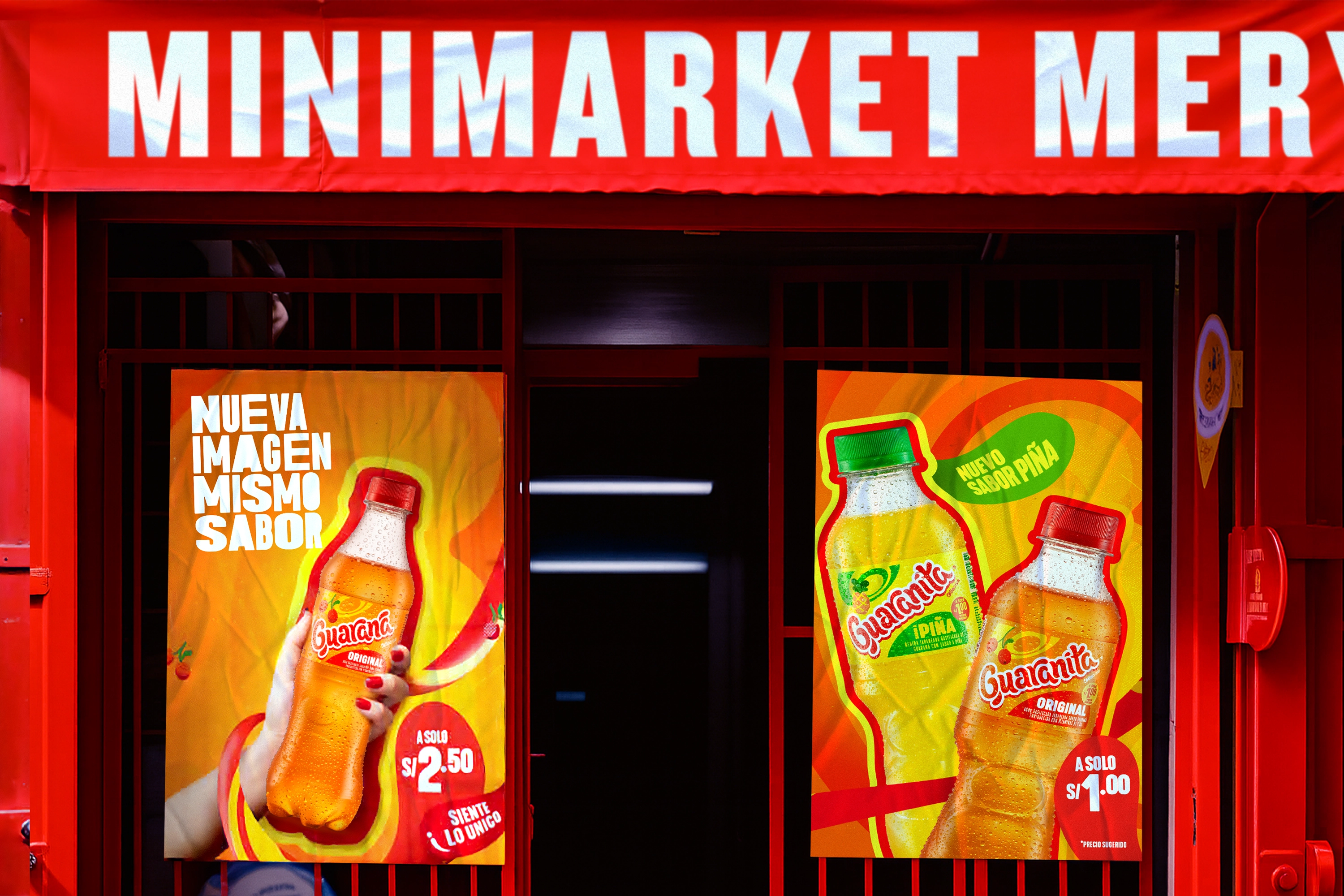
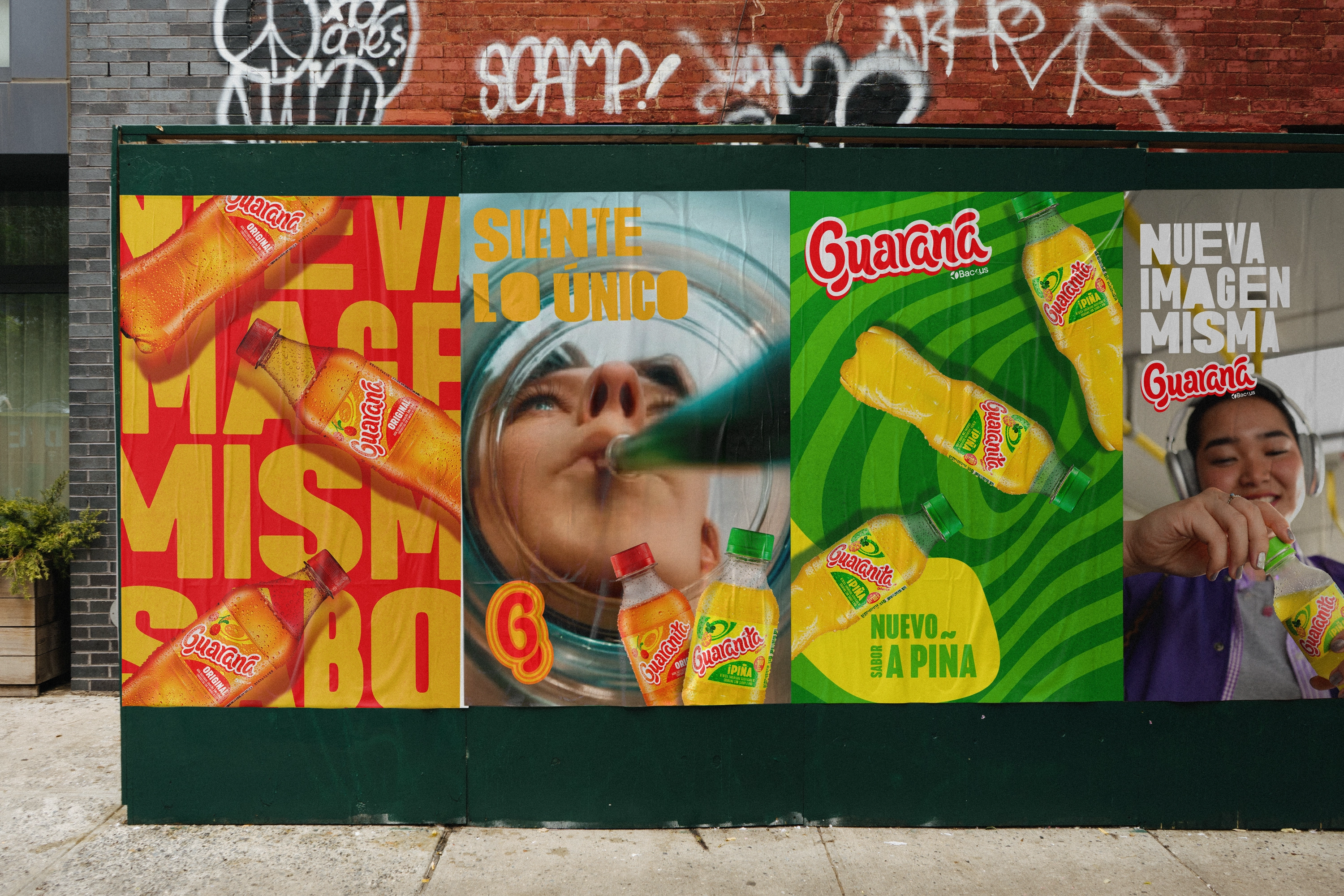
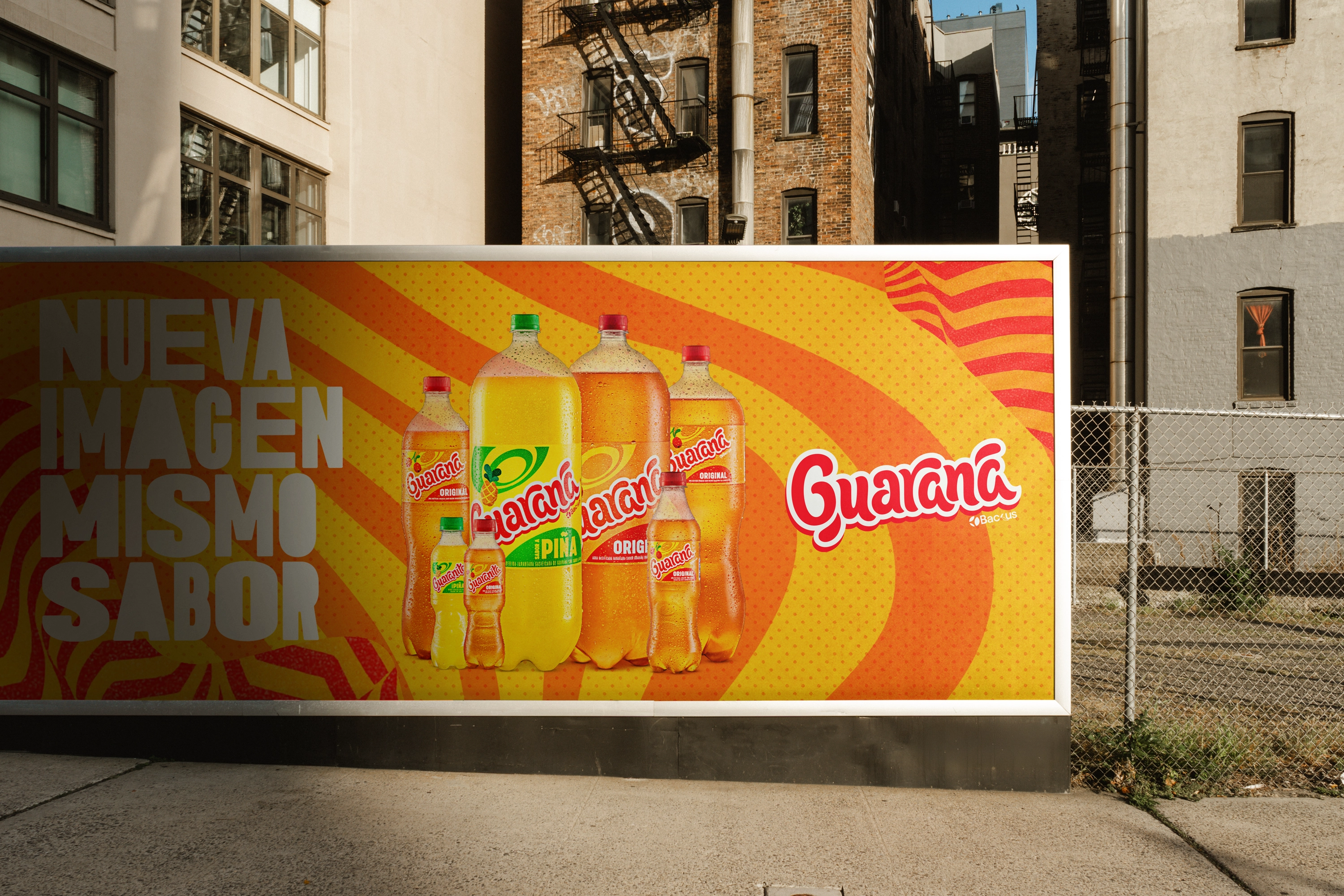
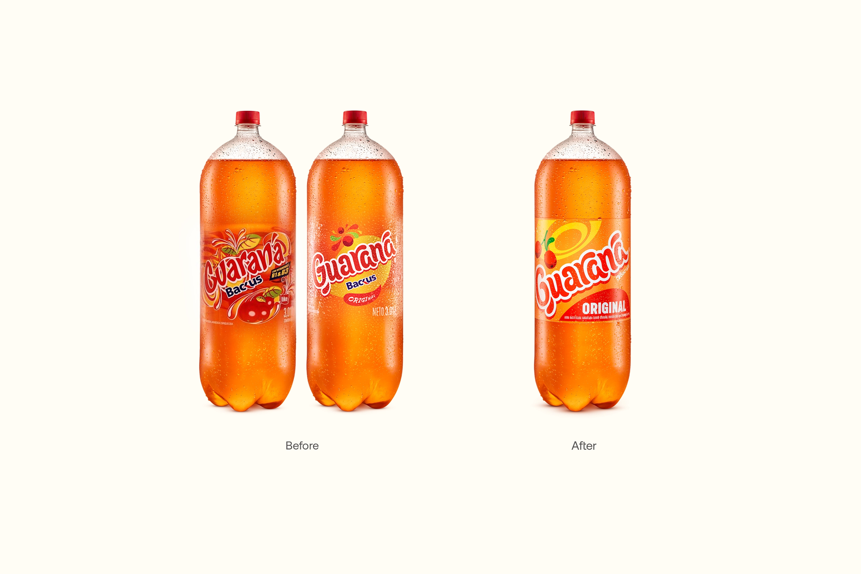
The challenge was to modernize Guaraná’s visual expression without breaking recognition or emotional attachment. Consumer research showed that the brand owned powerful visual assets, such as its orange color palette, icon, and typographic personality, but also revealed opportunities to improve balance, clarity, and system performance, particularly in an increasingly crowded retail environment.
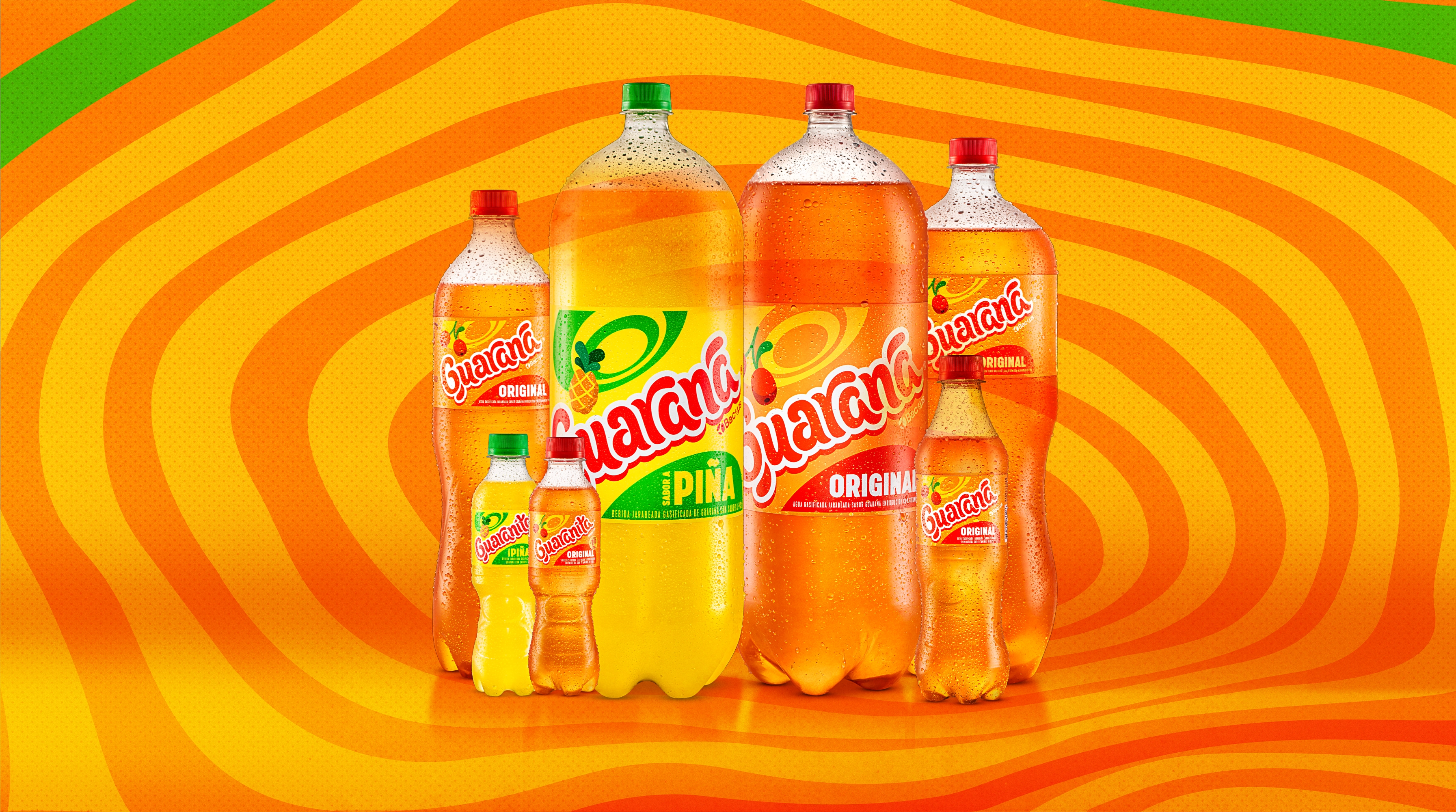
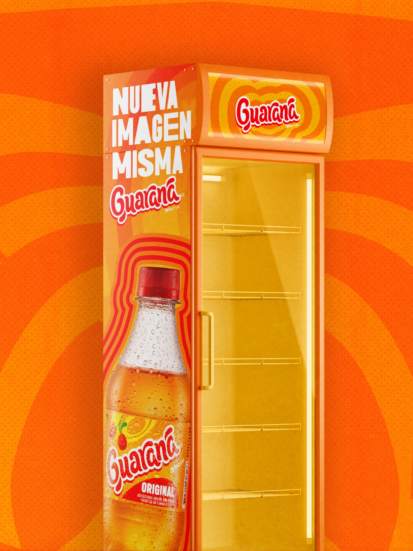
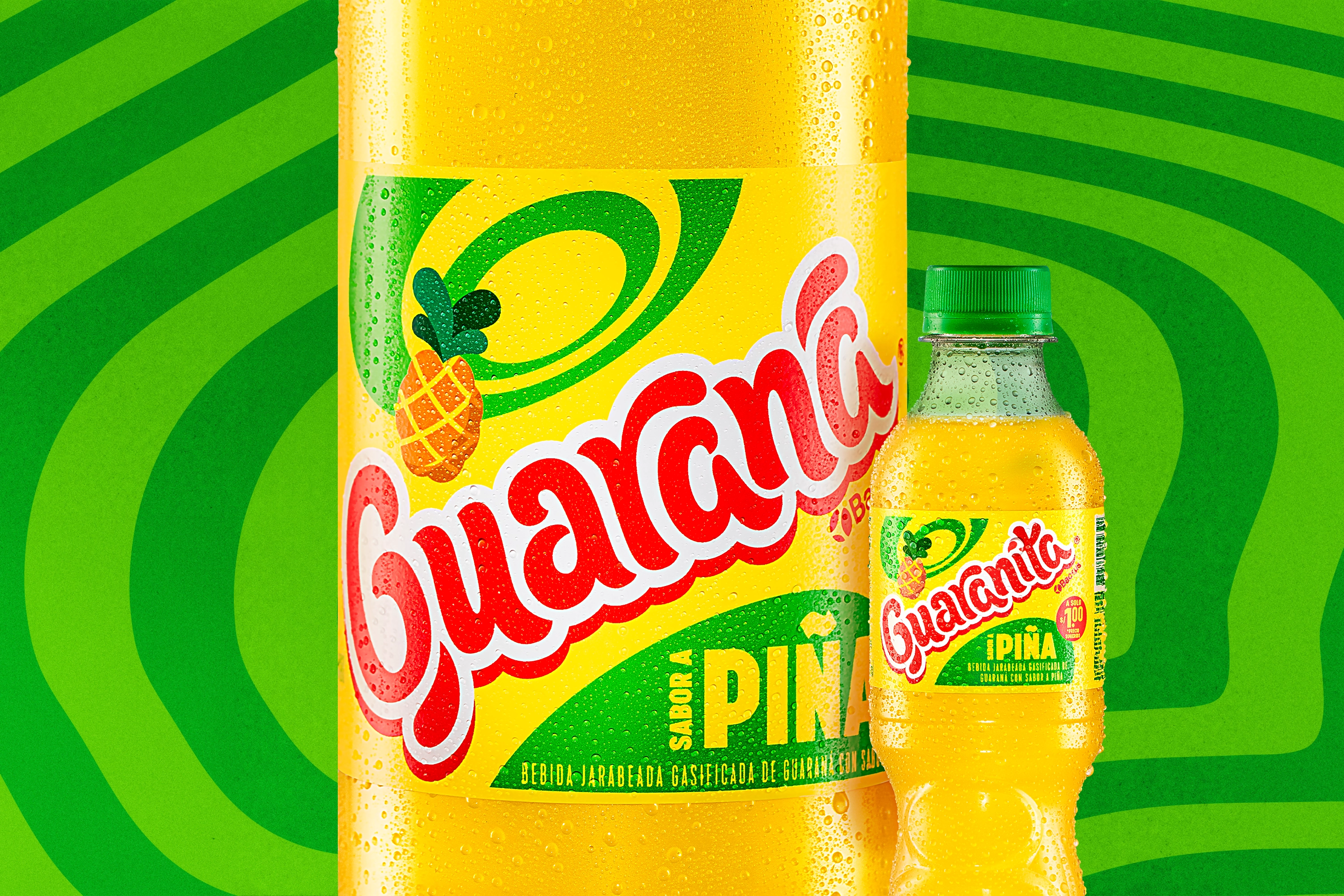
From a business perspective, the project was approached as a Visual Brand Update, not a full rebrand. The strategy focused on controlled evolution. Preserving the codes that built equity, organizing the visual system to perform better, and most importantly, preparing the brand to grow through innovation and portfolio expansion. Within this context, the launch of Guaraná Piña was not just a new flavor, but a strategic milestone. A real test of whether the brand system could adapt and grow without losing coherence or authenticity.
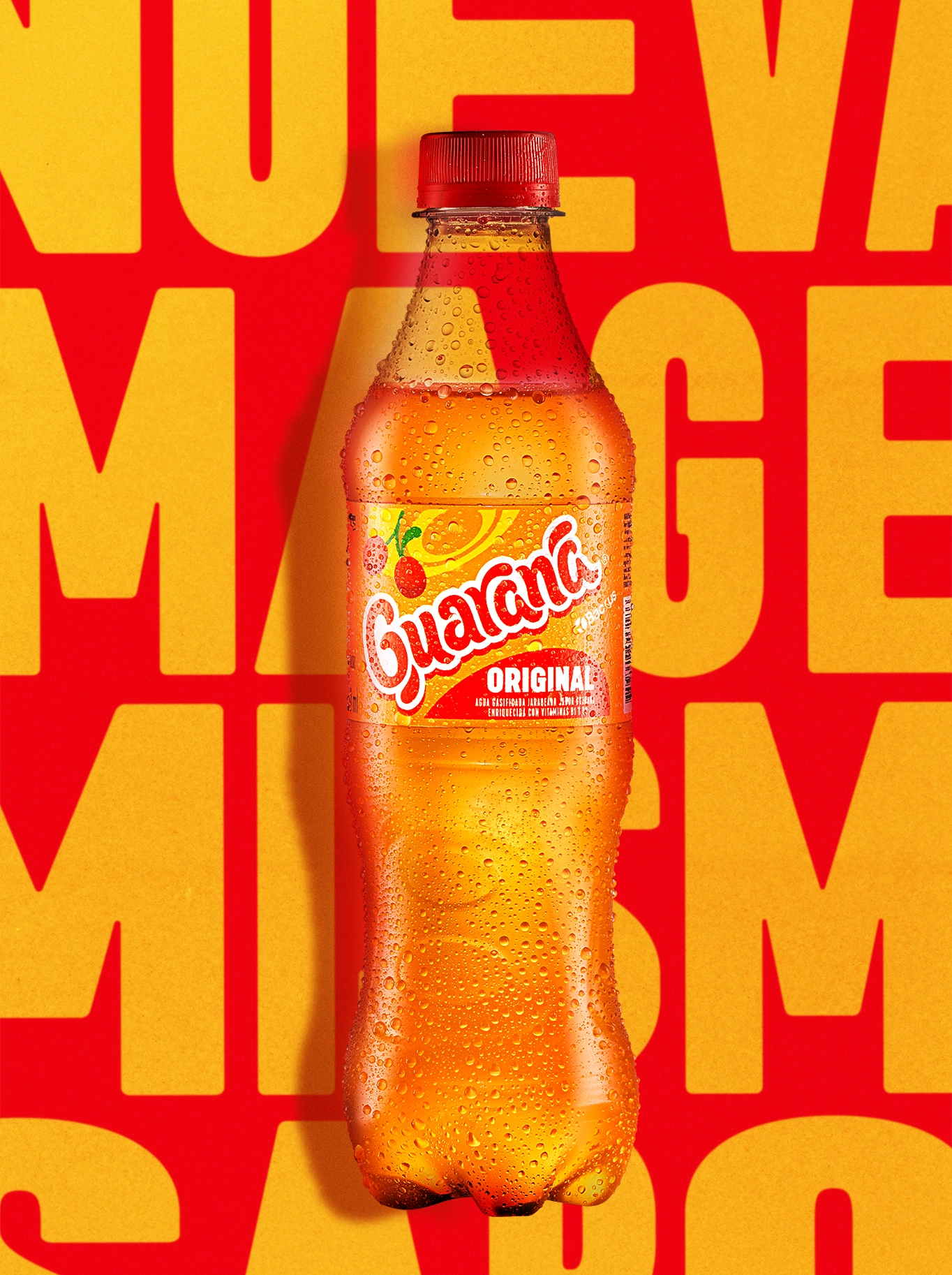
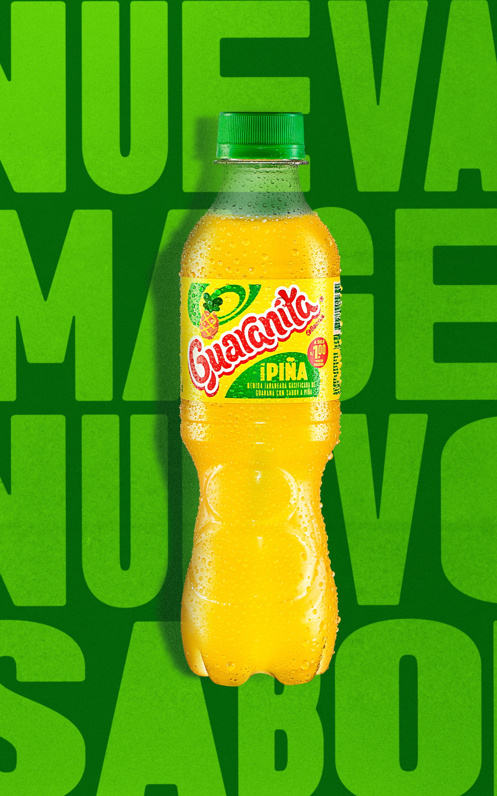
From a design standpoint, the work centered on building a scalable visual system. The original typography was refined and modernized while preserving its distinctive character, improving legibility and impact across formats. The icon remained central, with adjusted proportions and hierarchies to achieve a cleaner, more balanced layout. Fruit representation gained clarity and prominence, key to communicating flavor and naturality, allowing Guaraná Piña to stand out within the portfolio while staying clearly part of the core brand. Color logic was defined to enable future flavor extensions in a structured way, maintaining visual and emotional coherence across variants, including Zero.
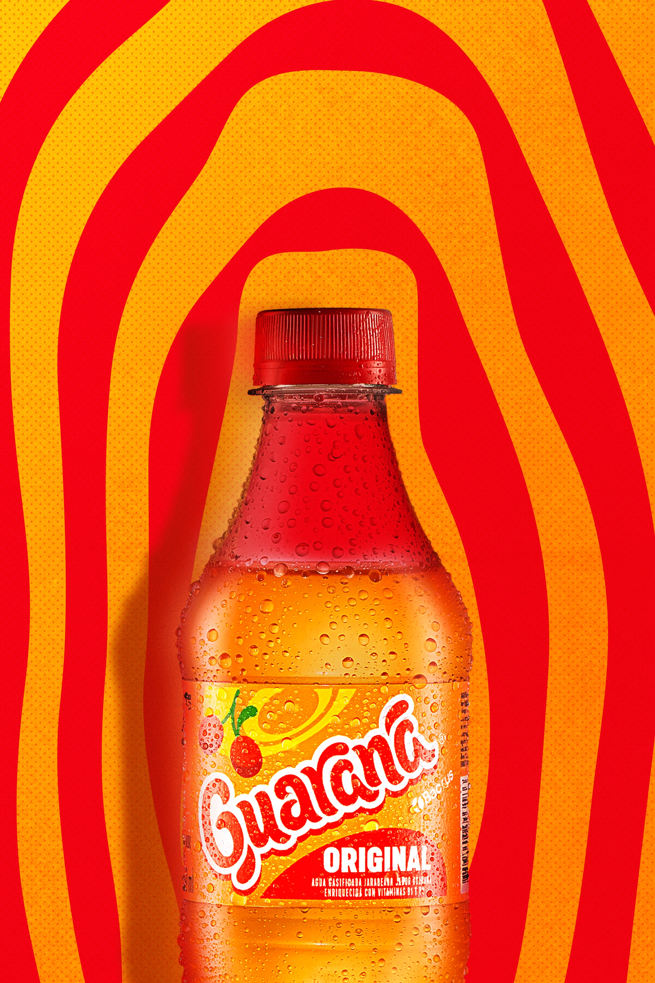
The result is a clearer, more modern, and scalable visual system. The update improved shelf readability, organized the portfolio, and enabled innovation launches such as Guaraná Piña with confidence and consistency. Beyond packaging, the project established a visual language ready to extend across other brand touchpoints, proving that brands with strong heritage can continue to grow when strategy, design, and innovation move together.