A design system that brings you closer to what you love most.
Addi is a fintech company that seeks to boost and enable digital commerce in Latin America. They want people to buy what they want, when they want, in an easy, fast and transparent way. As it should be. Thanks to zero-interest installments in alliance with thousands of businesses and brands that allow people to access the products they want the most in an easy way. It is the way to buy now and pay later without worrying about fees that stifle progress and giving access to credit to people who were previously seen as unappetizing for the traditional financial system, acting as a balancing element and providing opportunities never thought of before.
Across all touch points, financial brands must deliver simple, clear and personal messages. The nature of the category is so complex that it demands simplification on the part of brands if they are to communicate credibly and consistently across multiple touch points. Financial services brands must seek to maintain engagement and promote their brand values, provide reassurance and build trust. Also, B2B (business to business) brands must lose the fear of being more human, take elements from B2C (business to consumer) brands and think of all brands at their core as B2P (business to people). Successful brands will be those that focus on people's needs and not on products. Fintech brands must understand their customers as a relationship and not as a transaction. They must integrate into the customer journey and into their daily lives. Although e-commerce is booming, the human touch is still important to drive sales.
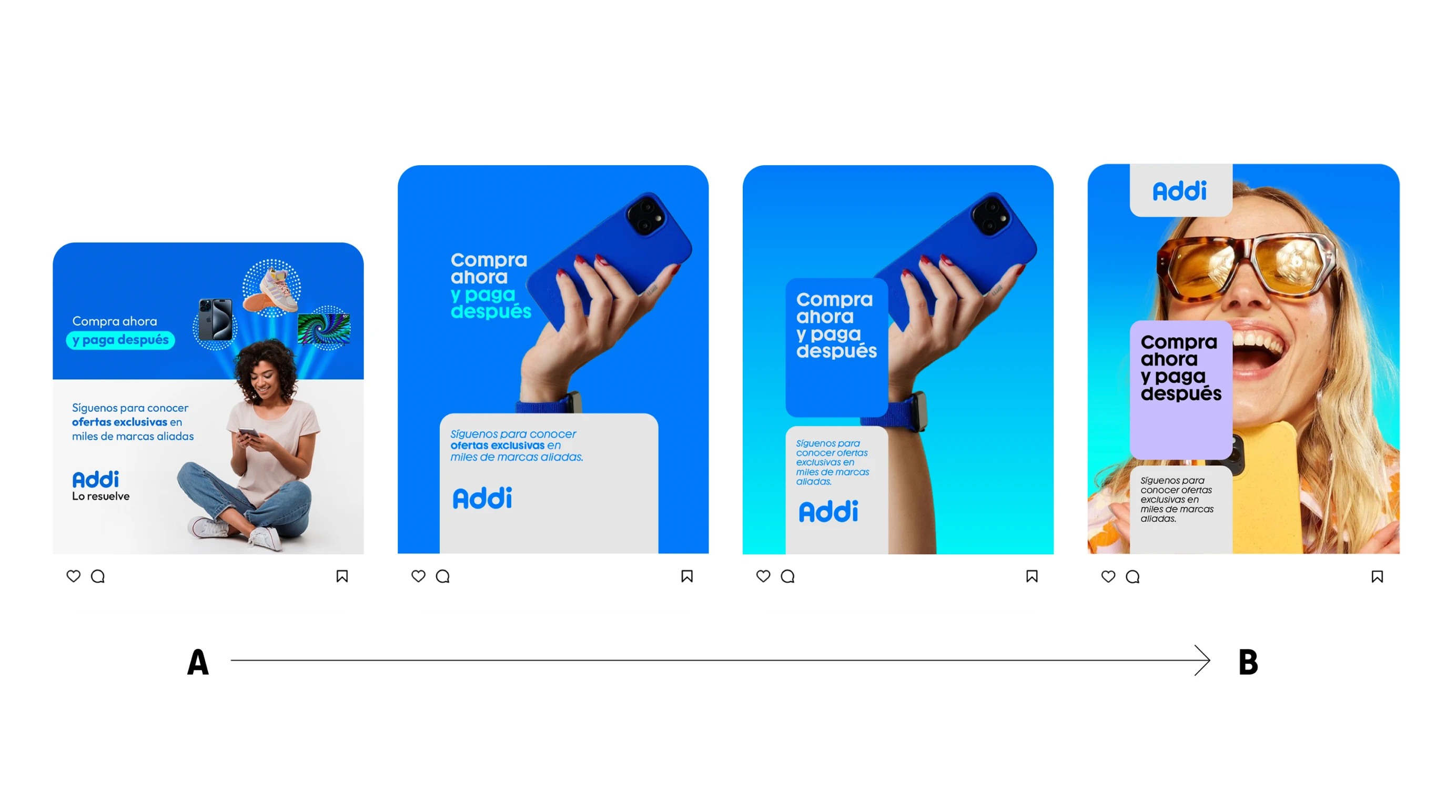
For Addi we come to an insight and that is that while shopping makes us happy and being able to access what we want so much generates happiness. Before and during the buying process there are different tensions and natural fears, especially for people abandoned by the financial system and with little support. That's how we came up with an analogy: the buying process is like a parachute jump at 8,000 meters high. We wanted to turn the brand into that ally that accompanies me and supports me throughout the process of this jump where different emotions from desire, fear or courage to happiness and / or tranquility. We created a visual metaphor for this parachute jump that no longer had to be faced alone, now it was faced in tandem or accompanied. Precisely, we created a visual resource for our content that appealed to this metaphor and literally brought the things I so desire closer and made them come true, mitigating all the negative emotions around the purchase and bringing peace of mind.
On the other hand, we created a grid that acts as a mesh that deforms and in printed pieces gives us the sensation of bringing closer what we most want. We added colors to the secondary color palette to express this optimism and give more resources beyond the traditional blue of the brand to give it dynamism and expressiveness. We created a set of complementary figures that would act as text containers highlighting different messages, moving away from the old-fashioned language of promotions and helping to expand the visual universe, maintaining the brand's legacy but giving it a new air for a whole new stage of maturity that required it.